

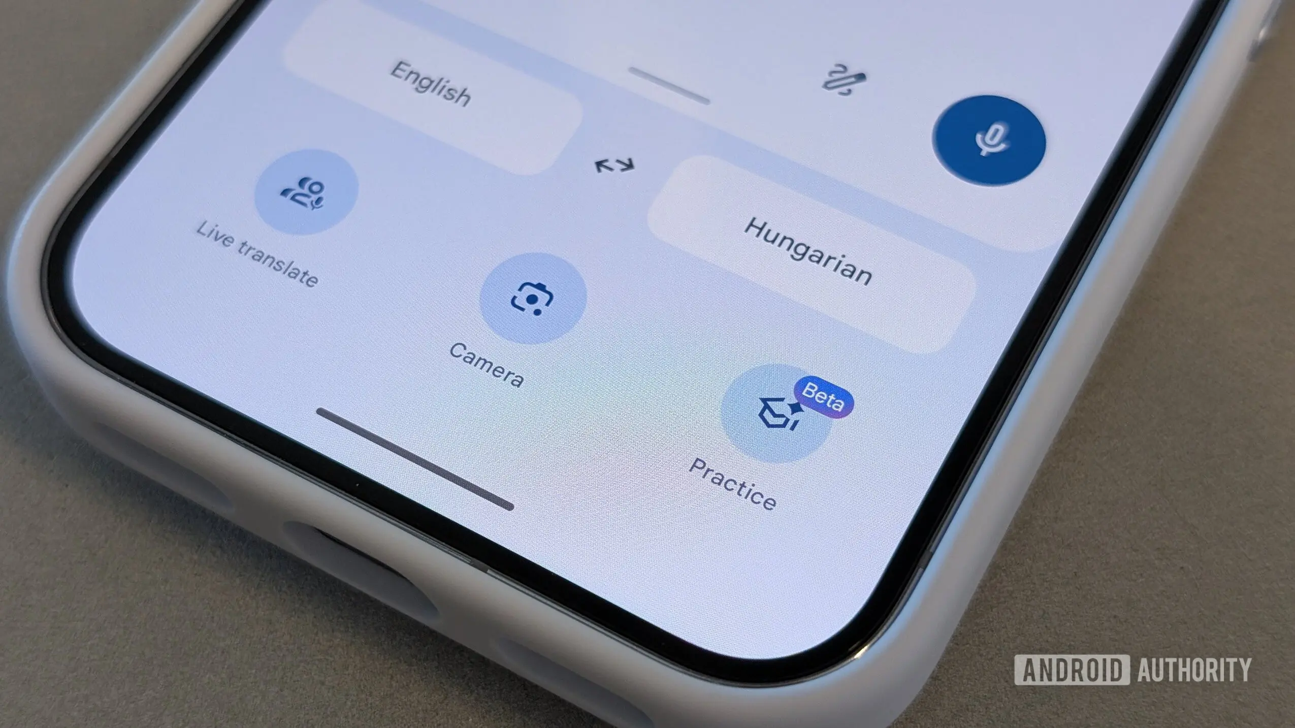
Google Translate has long been a vital tool for millions of users worldwide, offering instant translations across languages. However, its interface has remained largely unchanged for years, feeling outdated compared to other Google apps. Now, evidence from version 10.25 of the Android app suggests that Google is finally rolling out a significant redesign that modernizes the user experience.
Key changes at a glance
The most visible change is the new bottom navigation bar, which adopts a pill-shaped design with four core sections: Translate, Live, Camera, and Practice. This replaces the old full-width tab bar and provides quicker access to the app's expanding capabilities. The language selectors have been moved to the top of the screen, freeing up space for the translation area and reducing visual clutter.
The translation input box has been relocated to the bottom of the screen, appearing as a card that includes a microphone button, a paste shortcut, and a three-dot menu for additional options. This bottom-aligned input is more ergonomic for one-handed use, especially on larger phones. Contextual shortcuts, such as resuming recent language practice or conversations, now appear above the input card.
Improved organization and navigation
The old standalone Saved button has been replaced by a traditional hamburger menu in the top-left corner. Tapping this menu opens a new "Your activity" screen that consolidates translation history, saved translations, and saved transcripts. Previously, these were scattered across different parts of the app. This unified view makes it much easier to revisit past translations and track learning progress.
Secondary tools like the translation model picker and handwriting input have been moved into the three-dot menu within the input card, keeping the main interface clean while preserving access. The redesign also extends to the text input screen and the translation results page, both of which adopt a modern card-based layout similar to other Google apps like Google Maps and Google Photos.
Background: Why now?
Google Translate has evolved significantly in recent years, introducing features like real-time conversation mode, camera translation, and language practice. Yet its home screen remained largely the same since the Material Design era. The new redesign aligns with Google's broader push toward a more consistent and user-friendly interface across its services, especially as competition from Microsoft Translator and Apple's translation features intensifies.
Industry observers note that Google has been refining its design language with simpler shapes, more white space, and a focus on accessibility. The Translate update follows similar overhauls seen in Google Drive, Gmail, and Google News. The timing also coincides with the integration of generative AI features, with Google expected to add more context-aware translation options later this year.
User impact and reception
Early reactions from beta testers have been generally positive, with many appreciating the cleaner layout and improved navigation. However, some users have expressed concern about the removal of the dedicated Saved button, arguing that a hamburger menu adds an extra tap. Power users who rely on quick access to history may need time to adjust to the new activity screen. The bottom navigation bar has been praised for reducing hand movement, though the pill-shaped design has received mixed reviews—some find it stylish, while others prefer the more conventional full-width bar.
The redesign also affects how users interact with Live Translate and Practice mode. The new contextual shortcuts automatically surface relevant actions based on user behavior, such as offering to resume a recent conversation. This personalized touch is expected to increase engagement with the app's more advanced features.
Google has not yet announced a rollout date for the redesign. As with many pre-release features, there is a possibility that some elements may change before reaching the stable channel. Users who want to test the new look can join the Google Translate beta program on the Google Play Store, though availability may vary.
Overall, the redesign represents a thoughtful evolution of Google Translate, balancing modern aesthetics with functional improvements. By decluttering the interface and reorganizing key tools, Google ensures that the app remains useful for both casual users and language learners alike. The focus on card-based layouts and bottom navigation signals a shift toward more intuitive mobile design, which could serve as a template for other Google apps in the future.
As the world becomes increasingly interconnected, tools like Google Translate play a crucial role in breaking down language barriers. This modern makeover not only makes the app look better but also enhances its usability, ultimately helping users communicate more effectively across borders.
The changes are still in development, and further refinements may be applied before the public release. For now, the leaked images provide a compelling glimpse into Google's vision for the future of translation on mobile devices.
Source:Android Authority News